
Friday, May 13, 2011

Thursday, May 12, 2011


Saturday, May 7, 2011
"GOAL" assignment

The goas is to have a balanced life or try anyways. And to me these are some of the components:
to enriched your love towards your love ones, see the world, and in my case improve my art skills everyday, get real estate and overall be healthy!.
signature assignment

This is what I came up with as my signature. I thought that this could be use as a signature or maybe as a logo. On the word Alfredo I used different fonts just to show that when is time to create a lot of things happen in our minds or sketch books. And with the word Salanic it is a reflection when we go present our work we have to be a little bit more formal. Ok I hope it makes sense.


Thursday, May 5, 2011

Wednesday, May 4, 2011
A Alarcon Assignment 2: "Signature"
This is a rather recent work of mine. I actually made this little unity of letters during the second or third week of the semester I believe. And I showed it to David for his opinion.
I had always tried to make an image that combined all the letters of me first name into one object ever since middle school actually. But I had forgotten all about that until a few months ago and decided to give it another try just because. I felt I had gotten better at making that kind of thing with the years, and I feel like I have finally succeeded.
This is simply and image combining all the letters of my first name. AYAX
Now, this is not something I might use for signing checks and things of the sort, but I have the idea of using it for me digital work from now on. To try to make it a wee more professional.
These are other works I intended to use for this assignment but ended up making just for fun:


A Alarcon Assignment 2: "Goal"

Well, given that I just could not grasp me mind around coming with a self-explanatory image of the word GOAL I just simply came up with the idea of writing out what me GOAL is as of now.
I wrote 'To Design is me goal'. I didn't actually WRITE 'is me' but I intended to join the words 'To' and 'Design' as a form of design with the intention to prove me point.
And to top it all out I made a background with the words GOAL and wrote GOAL amongst them in me own writing in white to make it standout more.
And a hand written sig in the bottom left.
I want to design, to be a great designer. Kind of long term goal it might seem to me. Whether I might be considered good or competent as a designer, I want to be a GREAT designer.
To design is me goal.
CAzucena_Assignment:"Name"
 Went for a supernatural-dramatic piece.
I took a photo of my wife and make her act out doing a heart shape action with her hands.
Using Photoshop CS5 I took a photo added effects with the PEN Tool added different strokes.
In all, this was 28 layers from text, strokes, smart layers and ect. Enjoy.
Saturday, April 30, 2011
AHsu - Assig 2: Word it! - "Goal"

This is exactly what came into my mind when you said 'Goal.'
For those of you who are not sure what these are, these are the Quidditch Quaffle goals with a Chaser and Keeper.
I like the movement and energy of the figures. I like that they are in the air flying high above the ground. I like that the goals are so tall. I like that they have both jumped off their brooms with commitment to the present action. If I could have drawn it, I would have changed the perspective, so that we were looking at the goals from an angle and a little below, instead of straight on, to get a better sense of the stature of the goals and to emphasize the goals themselves more. I would also have had just one figure, the Chaser, and gotten a good look at the strain on his face and the reach of his arm. But again, as in my previous post, this image conveys what I wanted to convey far better than if I had attempted to draw it myself.
AHsu - Assig 3: Signature

This is the unique individual character in my Chinese name that indicates me. A lot of Chinese names are three characters: Surname-Generational name-Individual name. So I share the same middle character with my sister, but this character "yun" is my third character. My full name is "Hsu Xuan Yun" and you would call me by my given name, "Xuan Yun." It means "Looking out the window at the clouds." This third character, which I used as my signature, is the Chinese character for "cloud". So that's my signature.
I used the Mac font STKaiti after browsing all the available Asian fonts... this still isn't exactly how I would write it if I could wield a brush the way I would like, but it comes the closest, and it's better than if I wrote it with a brush or pen.
Friday, April 29, 2011

Wednesday, April 27, 2011
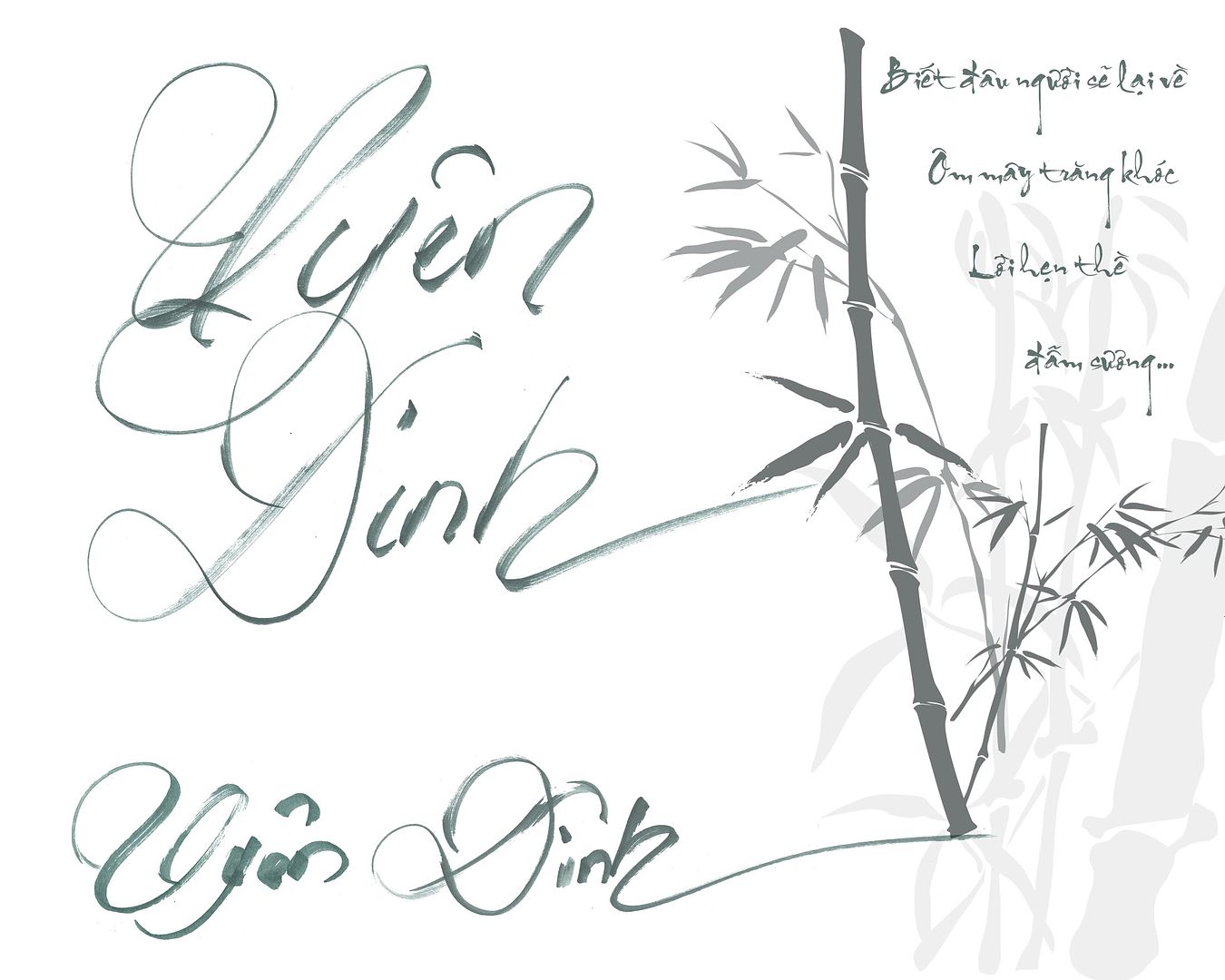
UDinh - Assign 3 - Signature

For better quality click here
This is how I write my name in Vietnamese. And that's my handwritten.
I wrote 2 versions: when the words stick together and when they stand side by side.
On the right is a poem which was my online signature. I just love to include it there. It's not mine. My friend wrote it for me a long time ago. And I used a Vietnamese font to make it look the way it should be ^^
The bamboo is a PTS brush (credit to MouritsaDA-Stock @ Deviantart.com)
Friday, April 15, 2011
RosaGvra: Assignment 3: Your Signature

I have had this signature since high school and have used it many times. I made my simple signature which is a combination of "R" and "G" in Photoshop and added some extra designs around it that describes a little about me. I love vintage, floral pictures and I love color. Well i hope you like it.
Thursday, April 7, 2011

Tuesday, April 5, 2011
RobertHenry_assignment2_ARTC1305/GOAL

This assignment was very fun. Thanks Professor Little. These are my goals from the less desired to the greatest expressed through Photo Shop. I manipulated the words and put pictures in the word GOAL, of what I desire to have in my life someday. The first vertical GOAL has my boo Buffy the body in a sexy leather out fit I picked for her. I'm a huge fan of her gluts by the way (lol)! 2nd GOAL has nothing but those hundreds because I would love to be a billionaire someday in order to bless my pastor & first lady some day.The 3rd manipulation is of course more of the lion of Judah (Jesus Christ) in my life. last but never less, the 4th GOAL represents the desire I have to know God on a whole different level. To finish this master piece up I add a GOAL as a background that reminded me of the new Knight rider car. With the word GOAL repeated this piece shows repetition. When I added pictures in the words I added my 3 of my favorites design techniques; figure ground reversal, unity & rhythm.
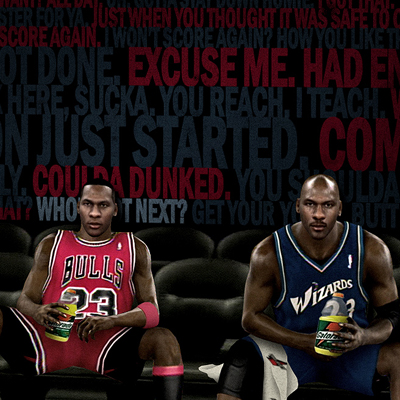
Robert Henry_Assignment3_ARTC1305
 This was done in photo shop. It shows symmetry at it's finest just as well as my favorite technique figure ground reversal. It also displays; unity,rhythm,repetition and emphasis. If you look closely superman, the superman insignia, and Dwight Howard is my background as repetitive and symmetrical balance. Gracefully, my name becomes the center of attention. to put the door nob on the door, when you look in my name you can see the new superman flying across a superman's insignia. I'm superman's greatest fan. Enjoy!
Thursday, March 31, 2011
Assignment 3: Your Signature
You are always signing your life away, either on a check, a contract, or even your homework... Especially THIS homework!
You're are going to create your signature. You can do this on a regular sheet of paper and a pen, construction paper and crayons, on the computer, or any form you want to create your name.
The piece should be 8"x10", or 720px by 576px at 72dpi if you're doing it on the computer.
Here is my submission:

The image was created in Illustrator using Rockwell Condensed, stretching the "11" to appear to merge with the "tt" in my name. The blocks were added to fill in the white space.
To learn how to install a font on a PC system, click here.
To learn how to install a font on a Mac, click here.
Take your time with this. You have until May 8th, at 11:59pm to finish this.
If you have any questions, please ask in the comments section.
Assignment 2: Word It!
UnderConsideration.com had a website where they would come up with a word and asked the followers of their blogs to come up with a design using what the artist imagines what that word means to them.
http://www.underconsideration.com/wordit/
Take your time to visit the site above and see the creativity of the various entries and get an idea on how you would create your piece. Your word to consider is:
First you need to think about what the word "Goal" means to you. It helps to visit the Dictionary and Wikipedia sites to give you an idea. From there come up with ideas on how you would design your creation. You are allowed to use whatever medium you wish, from scissors, paper, glue, crayons, and pencils (and scanned in) on up to Photoshop, Illustrator, MacPaint, Windows Paint, etc. You are also welcome to create more than one piece, but you will only be graded on one.
The piece needs to be on a 6"x6" sized image. That's 432px by 432px at 72dpi if you are doing it in the computer. I know it looks small, and you are welcome to do a larger piece if you want, but keep it at that size when posting it on the blog. I want to keep the file sizes down.
Here are my two examples (click to embiggen):

http://www.underconsideration.com/wordit/
Take your time to visit the site above and see the creativity of the various entries and get an idea on how you would create your piece. Your word to consider is:
Goal
First you need to think about what the word "Goal" means to you. It helps to visit the Dictionary and Wikipedia sites to give you an idea. From there come up with ideas on how you would design your creation. You are allowed to use whatever medium you wish, from scissors, paper, glue, crayons, and pencils (and scanned in) on up to Photoshop, Illustrator, MacPaint, Windows Paint, etc. You are also welcome to create more than one piece, but you will only be graded on one.
The piece needs to be on a 6"x6" sized image. That's 432px by 432px at 72dpi if you are doing it in the computer. I know it looks small, and you are welcome to do a larger piece if you want, but keep it at that size when posting it on the blog. I want to keep the file sizes down.
Here are my two examples (click to embiggen):


The first one is a cipher. It's the Japanese game "Go" and "Al" from Happy Days. Add them together to get "GoAl". The second is a word cloud generated at Wordle.net and with an arrow created in Illustrator.
Take your time with this. You have until May 8th, at 11:50pm to finish this.
If you have any questions, please ask in the comments section.
Thursday, March 3, 2011
A Great Idea! Rachel Lipman

I thought this was a really cool picture of McDonalds fries. I know that it is a Christmas ad from last year but I thought the way that the fries created a Christmas tree was awesome.
Now lets talk design stuff, I think that this ad has good background and foreground. It also shows good space and size.
Wednesday, March 2, 2011
RosaGvra: Assignment 1: A Good Idea

I found this image on the website Abduzeedo, which is a good website to learn and get inspired by other people's work. I like vector images and would like to learn how to make my own. It has foreground, background, unity, and balance by direction.
JJones-Assignment 1: A Good Idea
 I love this ad and would find it very gratifying to blow it up and hang it on my wall. Found it on Mother Earth Magazine website. The colors are fantastic and bright; it has unity, balance by position, radial balance, emphasis by placement and is symmetrical. The serif type font works very well, too.
AAlarcon - Assignment 1: A Good Idea
 Ok, I used this image because I just love anything CocaCola.
 I found this in a new website of theirs which was announcing a new vending machine that has all of the CocaCola-brand sodas.
And the reason I picked this one amongst others is because I like how instead of just taking pictures of the machines, they decided to render them digitally.
CAzucena_Assignment1:Good Idea

This is an AD from Canon that I've saved when this camera first came out.
The AD displays foreground/background, asymmetrical balance, radial balance and balance by position. The 7d logo zoomed in and the Earth in the background, together they bring unity. When I look at this ad it isn't the best that Canon has put out there, I wanted something that would include different types of balance.
Tuesday, March 1, 2011
Assign 1, A good idea
 I like this ad because of the placement of the furniture it guides your eyes
through the ad it has that z pattern grabs your attention. And if you look
at it shapes this ad has plenty squares, rectangles, circles, etc. It also has a
nice balance, foreground/background.
GTodd_Assignment 1 : A Good Idea
 Haha I really like this because what are the chances of going into a Mc.D's fast food and see a serial killer there eating a big mac. Im not sure what I see, I guess something close to Asymmetrical balance, line and shape, emphasis by placement, foreground and background !!! Leave me some comments and let me know what you see in this ad.
Saturday, February 26, 2011
AHsu - Assignment 1: A Good Idea

This ad was on the website grist.org, an online environmental news magazine and blog.
(link to pic: here)
I think it does well to reach its target audience. The forest in the background is a nice, relaxing shade of blue and green. Nice gradient flow from light to dark going from top to bottom. Well-balanced image. Even if there is no font on the top right, there is a sturdy tree trunk that gives that side of the ad weight. I like the transparent font 'SUSTAINABLE DESIGN' that makes it look like it's just another part of the fog in the rainforest. The other more opaque white that is used for the more detailed information is distinct and stands out well from the background. It is also very simple, with no superfluous details, which I immediately like. It gets its point across clearly and elegantly. What is it? Sustainable design. What about it? You can get an online Masters. From where? Boston Architectural College. What's my timeframe? Deadline March 1st if you want to get in this year. Nice pleasant ad that has all the pertinent info.
-Angela
Thursday, February 24, 2011

Thursday, February 17, 2011
UDinh - Assign 1 - A good idea
 I love its color ^^
- Line and shape: yes.
- Space: yes.
- Emphasis by placement: yes.
- Emphasis by contrast: yes.
A little of balance by direction, I guess. The way it makes you look right at the white space in the middle and then move to the white letter in the corner. At least, that's how I feel.
Edit:
One more picture, just because ^^

Tuesday, February 15, 2011

Assighnment1-Air Jordan X

In this spetacular pic Jordan indicates that if you wear his shoes you might be able to fly like him. LOL this ad relates to asymmetric balance and balance by direction when Jordan glides to the goal. This ad also adds rythm and unity as Jordan makes his way through the air to the basket with the same shoes being presented.
Jordan's gear

In this ad they were selling Jordan's gear. They used balance by direction, rhythm, and unity
Majic's 7up ad

Magic has always been one of my favorites. This 7up ad is very symmetrically balanced and the font used is perfect. As an addition, the artist of this ad used balance by direction ,which also gives notice to emphasis of the 7up can Magic is holding.

Sunday, February 13, 2011

Saturday, February 12, 2011
Assignment 1: A Good Idea
Finally! We are up and running with this thing!!
Okay, our first assignment will be entitled "A Good Idea"
1. Find a web ad on another site, not a text ad like Google Ads does. Find an advertisement that actually has a graphic. (Example seen below is from amazon.com)
2. Do a screen capture of the site. To find out how to do a screen capture visit: http://take-a-screenshot.org and/or download Jing at: http://www.techsmith.com/jing/. (Let it be known, I prefer Jing!) You may need to take the image into a image editor such as Photoshop and crop the image down.
I do not want to see an image of your entire desktop like this:

I want to see the ad you are showing us, like this:

BE SURE TO SAVE YOUR IMAGE TO SOMEWHERE YOU CAN EASILY FIND IT!!
A good place would be for you to create a folder on your desktop and call it "ARTC1305 - Blog" or something similar.
3. You've got your image, now you're ready to create a post. To learn how to post on this Blog, visit this link to Blogspot Help section on "How Do I Post on my Blog?": http://www.google.com/support/blogger/bin/answer.py?hl=en&answer=41378
MAKE SURE YOU ARE LOGGED IN BEFORE YOU POST! THE DASHBOARD LINK IS NOT AVAILABLE TO YOU UNLESS YOU ARE LOGGED IN!
In the "Title" box post "YourFistInitialandLastName - Assignment 1 : A Good Idea". For example my title post would read "DLittle - Assignment 1: A Good Idea".
Now you are going to need to post your image. Underneath your "Title" box is the menu for the post body, or the place where you will be entering your text and images for the blog post.

This is where saving your ad image to a location you can find easily will help. Click the "Insert Image", then "Choose Files" button, and navigate to where you saved your image. When you find the image, click to select the image and click the "Add Selected" button. It should then post the image to the body of your blog post.
You can find your images you have uploaded at: https://picasaweb.google.com/thedolittle/ARTC1305BasicGraphicDesign#
4. Now is the time to write some text. You will need to put some space after the image you posted, so click your mouse after your image and hit the "Enter" key a couple of times. Start writing your little 3 paragraph report on where you found the image and what you like and don't like about the image. Remember to use some of the design terms you've learned in class. Remember to proofread and re-proofread before hitting the orange "Publish Post" button at the bottom of the page. (If you do make a mistake, it's okay. You can go back and edit your post: http://www.google.com/support/blogger/bin/answer.py?hl=en&answer=41382)
5. Now you may think you're done, but not yet. All of your classmates will be creating their own posts, and you will comment on their posts and they will be commenting on your's. Don't just post something like "Good Job!" or "EPIC FAIL!" or "All Your Base Are Belong to Us!". Post something substantial. Be sure to use your design terminology.
Any other questions on how to navigate, post, edit, etc. on Blogspot visit:
http://www.google.com/support/blogger/bin/topic.py?hl=en&topic=12457
If you are having any other problems, email me.
This assignment is due by 11:59pm on March 3rd.
Okay, our first assignment will be entitled "A Good Idea"
1. Find a web ad on another site, not a text ad like Google Ads does. Find an advertisement that actually has a graphic. (Example seen below is from amazon.com)
2. Do a screen capture of the site. To find out how to do a screen capture visit: http://take-a-screenshot.org and/or download Jing at: http://www.techsmith.com/jing/. (Let it be known, I prefer Jing!) You may need to take the image into a image editor such as Photoshop and crop the image down.
I do not want to see an image of your entire desktop like this:

I want to see the ad you are showing us, like this:
BE SURE TO SAVE YOUR IMAGE TO SOMEWHERE YOU CAN EASILY FIND IT!!
A good place would be for you to create a folder on your desktop and call it "ARTC1305 - Blog" or something similar.
3. You've got your image, now you're ready to create a post. To learn how to post on this Blog, visit this link to Blogspot Help section on "How Do I Post on my Blog?": http://www.google.com/support/blogger/bin/answer.py?hl=en&answer=41378
MAKE SURE YOU ARE LOGGED IN BEFORE YOU POST! THE DASHBOARD LINK IS NOT AVAILABLE TO YOU UNLESS YOU ARE LOGGED IN!
In the "Title" box post "YourFistInitialandLastName - Assignment 1 : A Good Idea". For example my title post would read "DLittle - Assignment 1: A Good Idea".
Now you are going to need to post your image. Underneath your "Title" box is the menu for the post body, or the place where you will be entering your text and images for the blog post.

This is where saving your ad image to a location you can find easily will help. Click the "Insert Image", then "Choose Files" button, and navigate to where you saved your image. When you find the image, click to select the image and click the "Add Selected" button. It should then post the image to the body of your blog post.
You can find your images you have uploaded at: https://picasaweb.google.com/thedolittle/ARTC1305BasicGraphicDesign#
4. Now is the time to write some text. You will need to put some space after the image you posted, so click your mouse after your image and hit the "Enter" key a couple of times. Start writing your little 3 paragraph report on where you found the image and what you like and don't like about the image. Remember to use some of the design terms you've learned in class. Remember to proofread and re-proofread before hitting the orange "Publish Post" button at the bottom of the page. (If you do make a mistake, it's okay. You can go back and edit your post: http://www.google.com/support/blogger/bin/answer.py?hl=en&answer=41382)
5. Now you may think you're done, but not yet. All of your classmates will be creating their own posts, and you will comment on their posts and they will be commenting on your's. Don't just post something like "Good Job!" or "EPIC FAIL!" or "All Your Base Are Belong to Us!". Post something substantial. Be sure to use your design terminology.
Any other questions on how to navigate, post, edit, etc. on Blogspot visit:
http://www.google.com/support/blogger/bin/topic.py?hl=en&topic=12457
If you are having any other problems, email me.
This assignment is due by 11:59pm on March 3rd.
Monday, January 31, 2011
Subscribe to:
Posts (Atom)