Finally! We are up and running with this thing!!
Okay, our first assignment will be entitled "A Good Idea"
1. Find a web ad on another site, not a text ad like Google Ads does. Find an advertisement that actually has a graphic. (Example seen below is from amazon.com)
2. Do a screen capture of the site. To find out how to do a screen capture visit:
http://take-a-screenshot.org and/or download Jing at:
http://www.techsmith.com/jing/. (Let it be known, I prefer Jing!) You may need to take the image into a image editor such as Photoshop and crop the image down.
I do not want to see an image of your entire desktop like this:
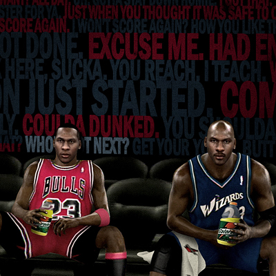
I want to see the ad you are showing us, like this:
BE SURE TO SAVE YOUR IMAGE TO SOMEWHERE YOU CAN EASILY FIND IT!!
A good place would be for you to create a folder on your desktop and call it "ARTC1305 - Blog" or something similar.
3. You've got your image, now you're ready to create a post. To learn how to post on this Blog, visit this link to Blogspot Help section on "How Do I Post on my Blog?":
http://www.google.com/support/blogger/bin/answer.py?hl=en&answer=41378
MAKE SURE YOU ARE LOGGED IN BEFORE YOU POST! THE DASHBOARD LINK IS NOT AVAILABLE TO YOU UNLESS YOU ARE LOGGED IN!
In the "Title" box post "YourFistInitialandLastName - Assignment 1 : A Good Idea". For example my title post would read "DLittle - Assignment 1: A Good Idea".
Now you are going to need to post your image. Underneath your "Title" box is the menu for the post body, or the place where you will be entering your text and images for the blog post.
This is where saving your ad image to a location you can find easily will help. Click the "Insert Image", then "Choose Files" button, and navigate to where you saved your image. When you find the image, click to select the image and click the "Add Selected" button. It should then post the image to the body of your blog post.
You can find your images you have uploaded at:
https://picasaweb.google.com/thedolittle/ARTC1305BasicGraphicDesign#
4. Now is the time to write some text. You will need to put some space after the image you posted, so click your mouse after your image and hit the "Enter" key a couple of times. Start writing your little 3 paragraph report on where you found the image and what you like and don't like about the image. Remember to use some of the design terms you've learned in class. Remember to proofread and re-proofread before hitting the orange "Publish Post" button at the bottom of the page. (If you do make a mistake, it's okay. You can go back and edit your post:
http://www.google.com/support/blogger/bin/answer.py?hl=en&answer=41382)
5. Now you may think you're done, but not yet. All of your classmates will be creating their own posts, and you will comment on their posts and they will be commenting on your's. Don't just post something like "Good Job!" or "EPIC FAIL!" or "All Your Base Are Belong to Us!". Post something substantial. Be sure to use your design terminology.
Any other questions on how to navigate, post, edit, etc. on Blogspot visit:
http://www.google.com/support/blogger/bin/topic.py?hl=en&topic=12457
If you are having any other problems, email me.
This assignment is due by 11:59pm on March 3rd.


