The Blog for the ARTC 1305 Basic Graphic Design class at Houston Community College
Tuesday, February 15, 2011
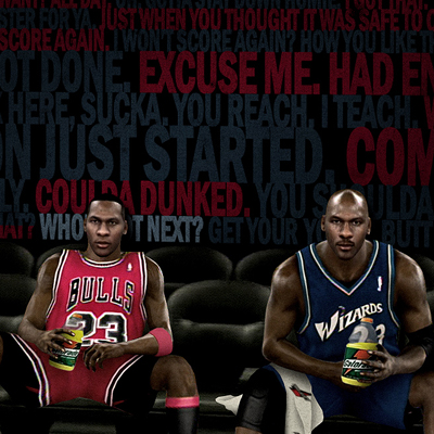
Majic's 7up ad
Magic has always been one of my favorites. This 7up ad is very symmetrically balanced and the font used is perfect. As an addition, the artist of this ad used balance by direction ,which also gives notice to emphasis of the 7up can Magic is holding.
I agree, Magic's has always had that big toothy smile and it does focus the emphasis there. C'mon! We can't ignore the white shape in the dark backgound. His teeth are the foreground and his face is the background. We learned this early on in class.
And the 7up can does create a second emphasis, the text creates a third, and your eye follows it in almost that order. The red dot in the logo creates yet another smaller emphasis within the logo.
Be sure to check out the new 7up logo here: http://www.underconsideration.com/brandnew/archives/guten_tag_7up.php
The bad news: it is somewhat dated, even when it was first published back in the late-seventies/early-eighties. It was a few years later the "Cola Wars" and 7up went the route of the "Un-Cola" (although being owned by Pepsi) and had an even more interesting campaign.

My eyes focus on his smile, not the can >"< Don't know why.
ReplyDeleteI think the red circle save this ads though, nice contrasted color ^^
The best of all three, I like this ad also.
ReplyDeleteHis face is the focus, not the 7 up...it is kind of an after thought.
ReplyDeleteMy eyes first hits the can, to Magic's smile then down to the "FEELIN' 7UP." Everything together brings a sense of unity.
ReplyDeleteI agree, Magic's has always had that big toothy smile and it does focus the emphasis there. C'mon! We can't ignore the white shape in the dark backgound. His teeth are the foreground and his face is the background. We learned this early on in class.
ReplyDeleteAnd the 7up can does create a second emphasis, the text creates a third, and your eye follows it in almost that order. The red dot in the logo creates yet another smaller emphasis within the logo.
Be sure to check out the new 7up logo here: http://www.underconsideration.com/brandnew/archives/guten_tag_7up.php
The bad news: it is somewhat dated, even when it was first published back in the late-seventies/early-eighties. It was a few years later the "Cola Wars" and 7up went the route of the "Un-Cola" (although being owned by Pepsi) and had an even more interesting campaign.
I have to agree the ad is an bit dated. When I look at the ad - I go to his smile not the 7UP can.
ReplyDelete